Tips for customizing Godot's HTML5 Loading Screen
Hey, ever wanted to change Godot's HTML5 loading screen?
I mean, consider the page for Lights Out, a game we made for the Nokia Jam #4:
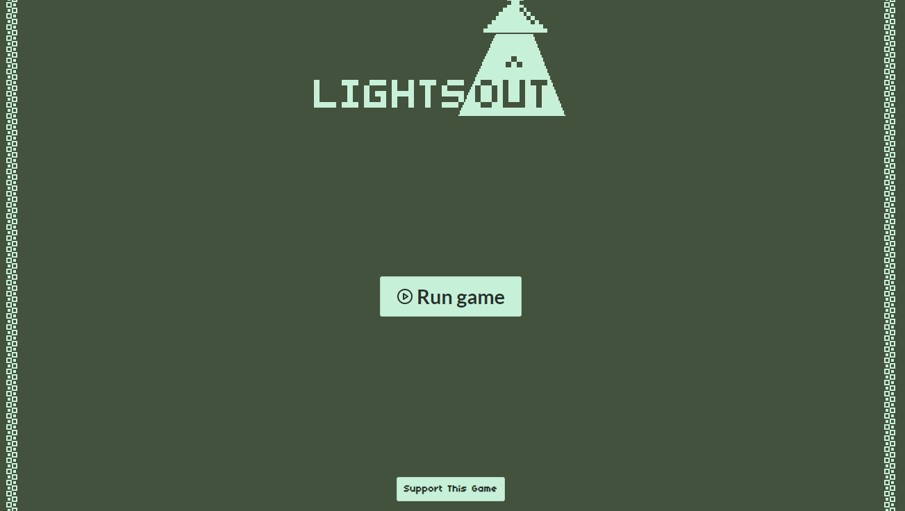
It is thematically consistent, isn't it? However, as soon as the player presses the Run game button...
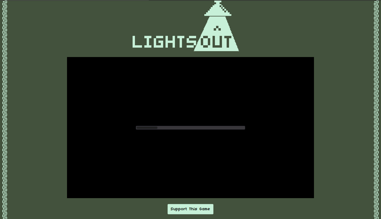
Aaaaaaaaaaaaaaaand now, our consistency is lost.
However, changing this loading screen styling is quite easy! I haven't found a guide on this, so below is my take on this.
- First step is to open the .html file Godot generates when you export your game: however, don't open it with your browser! Use a software like Window's Notepad, or Notepad++, or VSCode... you decide.

- Now, we just need to change the correct CSS parameters on this file! And that's it. In case you don't know CSS, however, well, me neither! But you can always poke things in the file and find out what they do.
Here is what I found out by testing stuff:
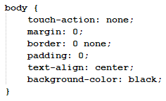
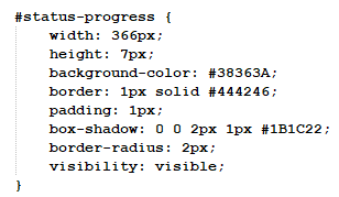
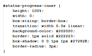
As an example, for Lights Out I used the following configuration:
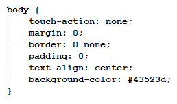
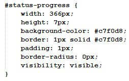
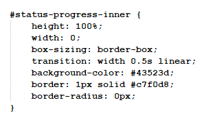
And the result is:
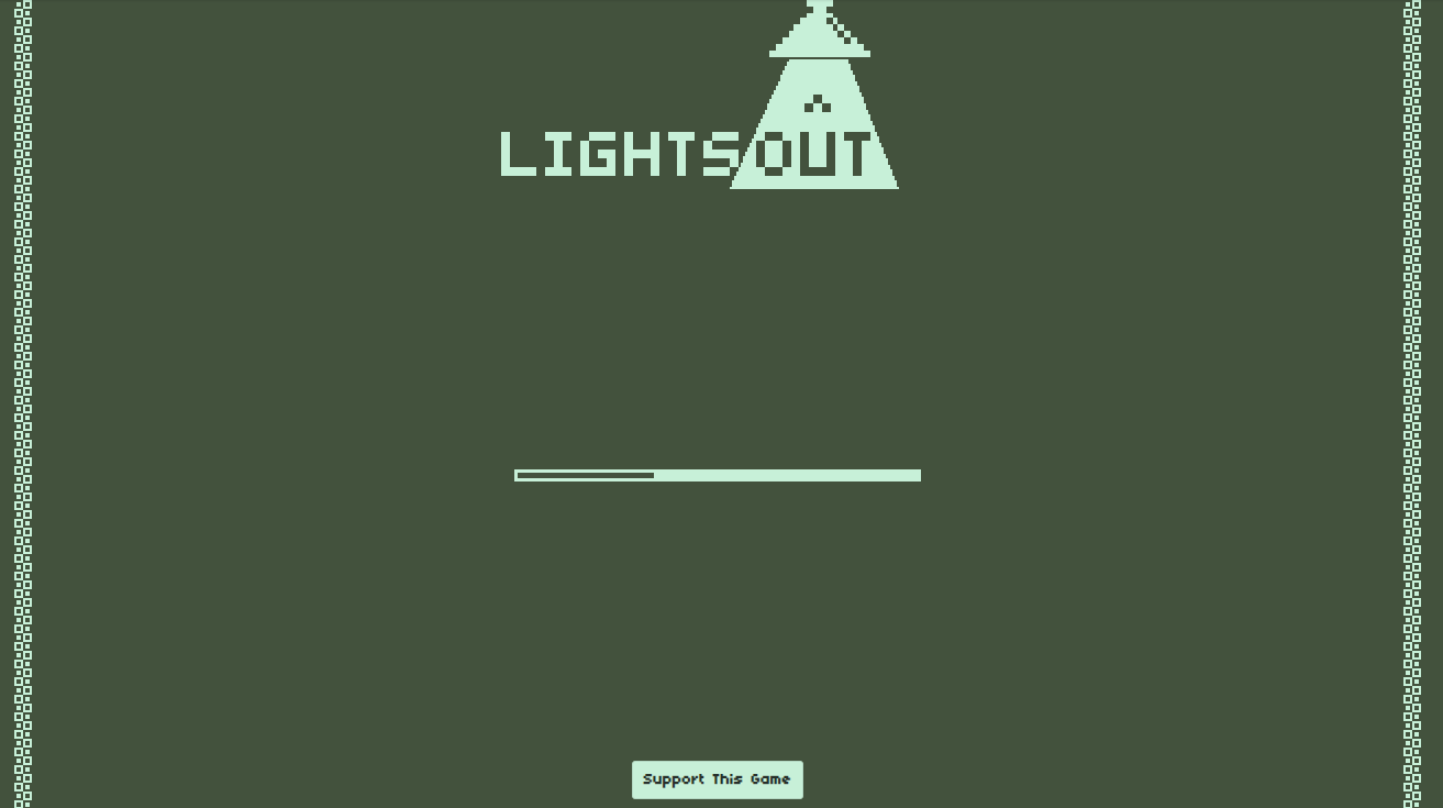
Much better, isn't it? At least I think it is a lot better now.
Well, this was quite a small guide, but I hope it at least gave you some ideas on how to customize more your web builds.
Anyway, thanks for reading! Feel free to leave a comment down if you have any questions or anything like that :)
Get Lights Out
Lights Out
It's up to you to fix a lightbulb on a factory
| Status | Released |
| Author | Escada Games |
| Genre | Platformer |
| Tags | 1-bit, 2D, godot-engine, Minimalist, Pixel Art, Short |
Comments
Log in with itch.io to leave a comment.
ty for this tutorial, it's really helpful.
also i found this video, i will put here to help others
Good Staffs!